Near Lock App
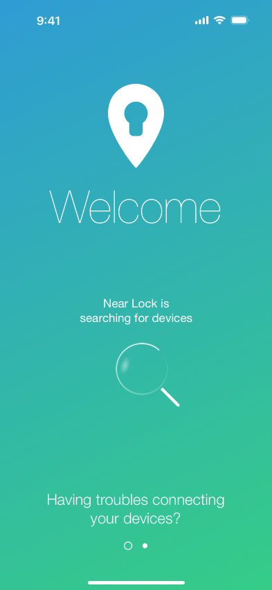
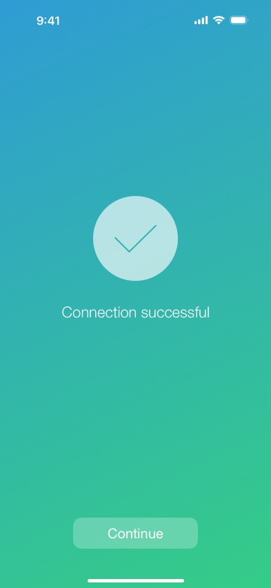
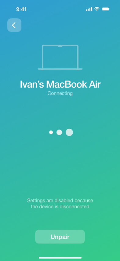
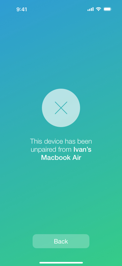
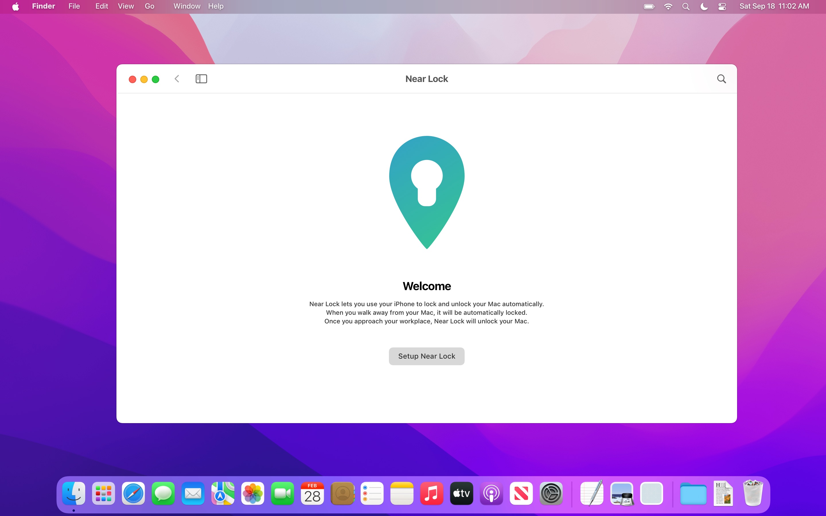
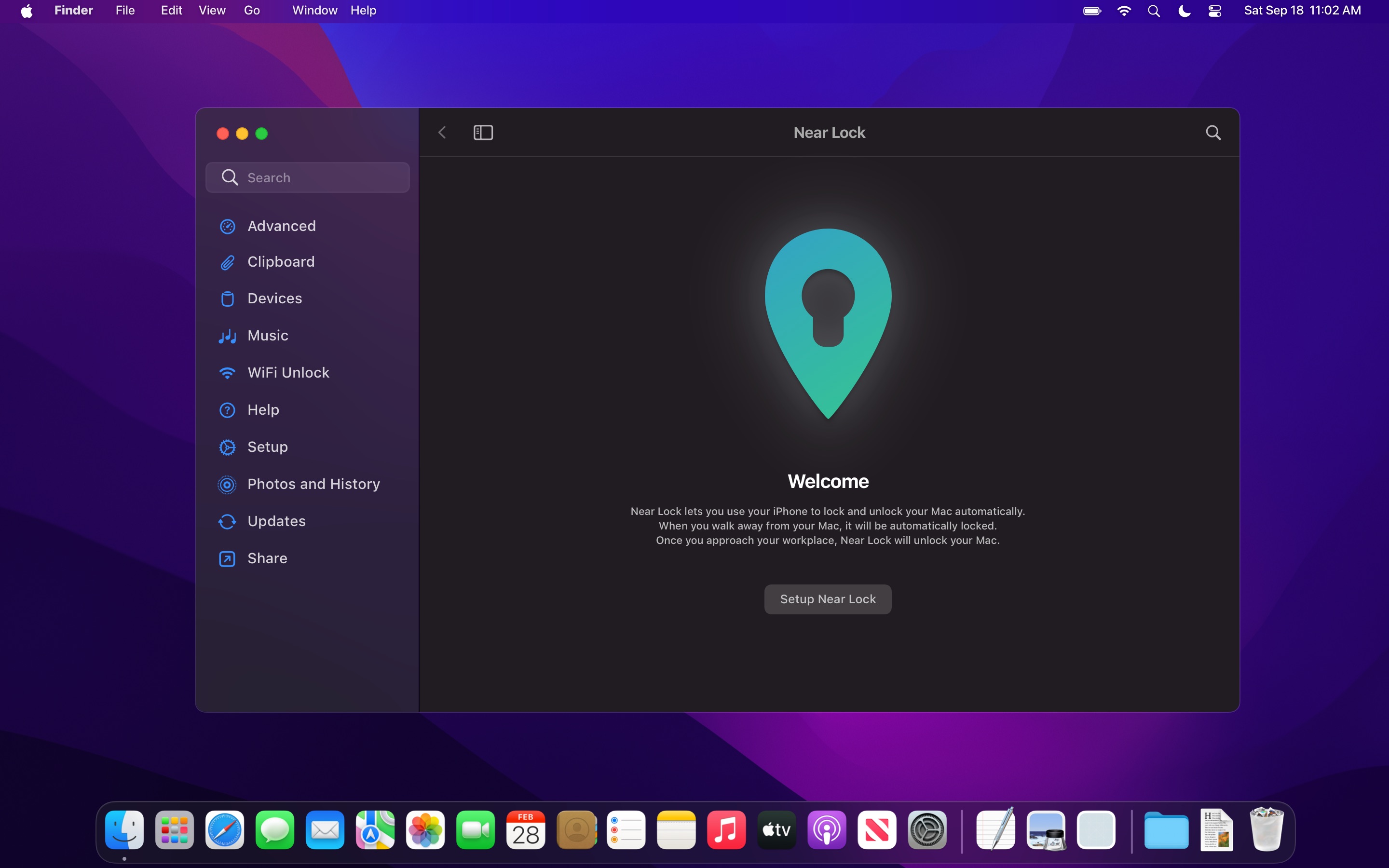
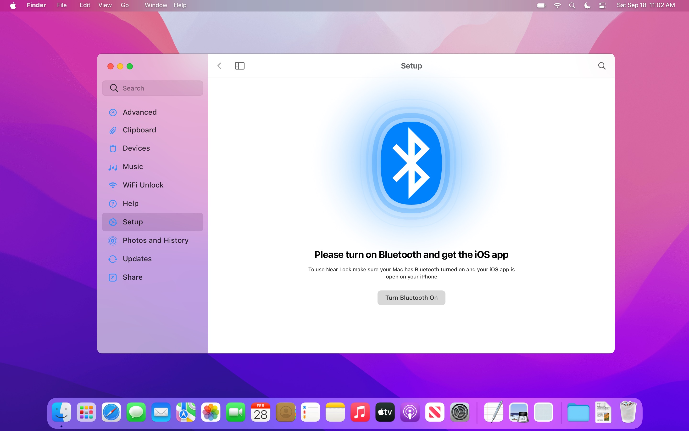
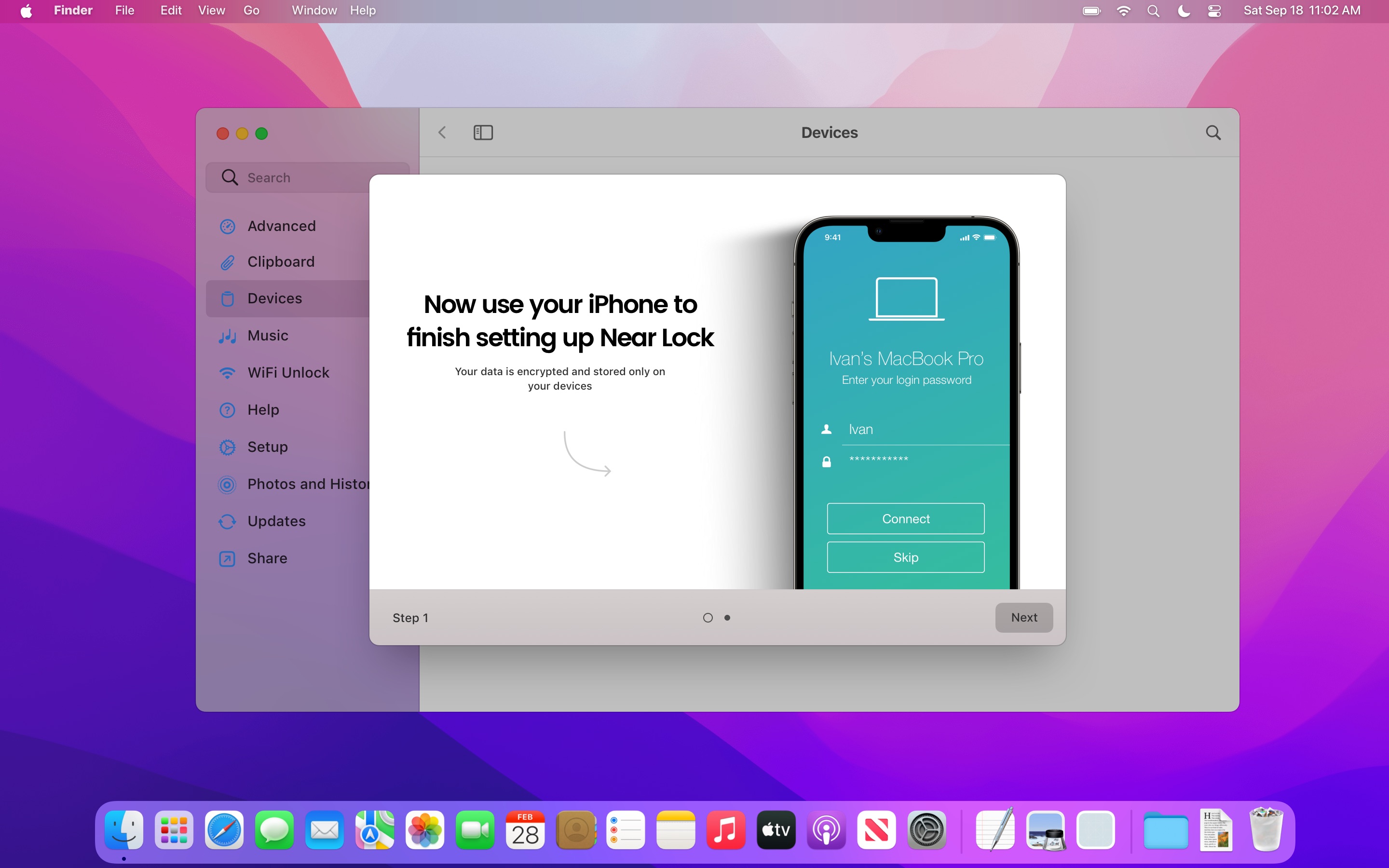
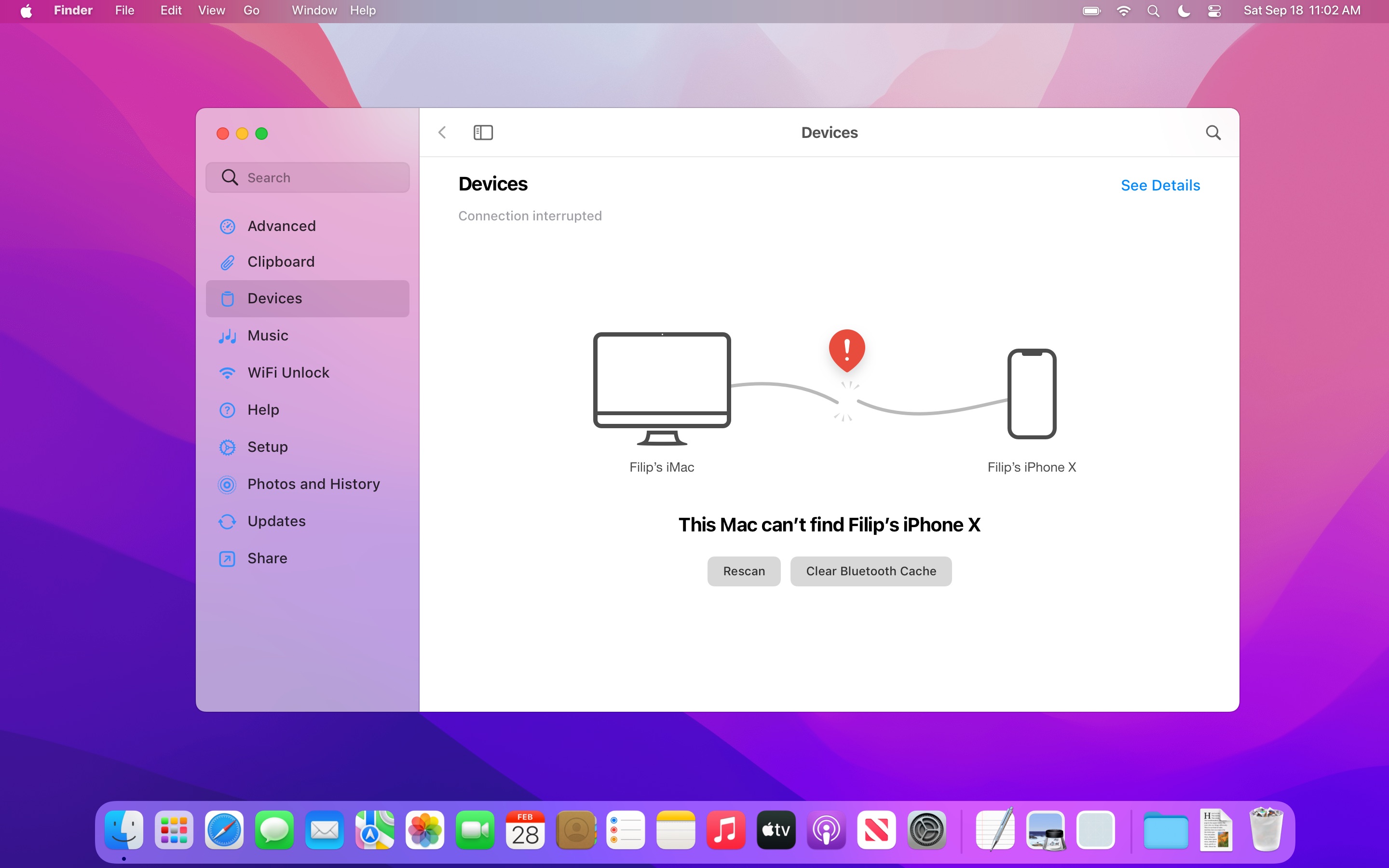
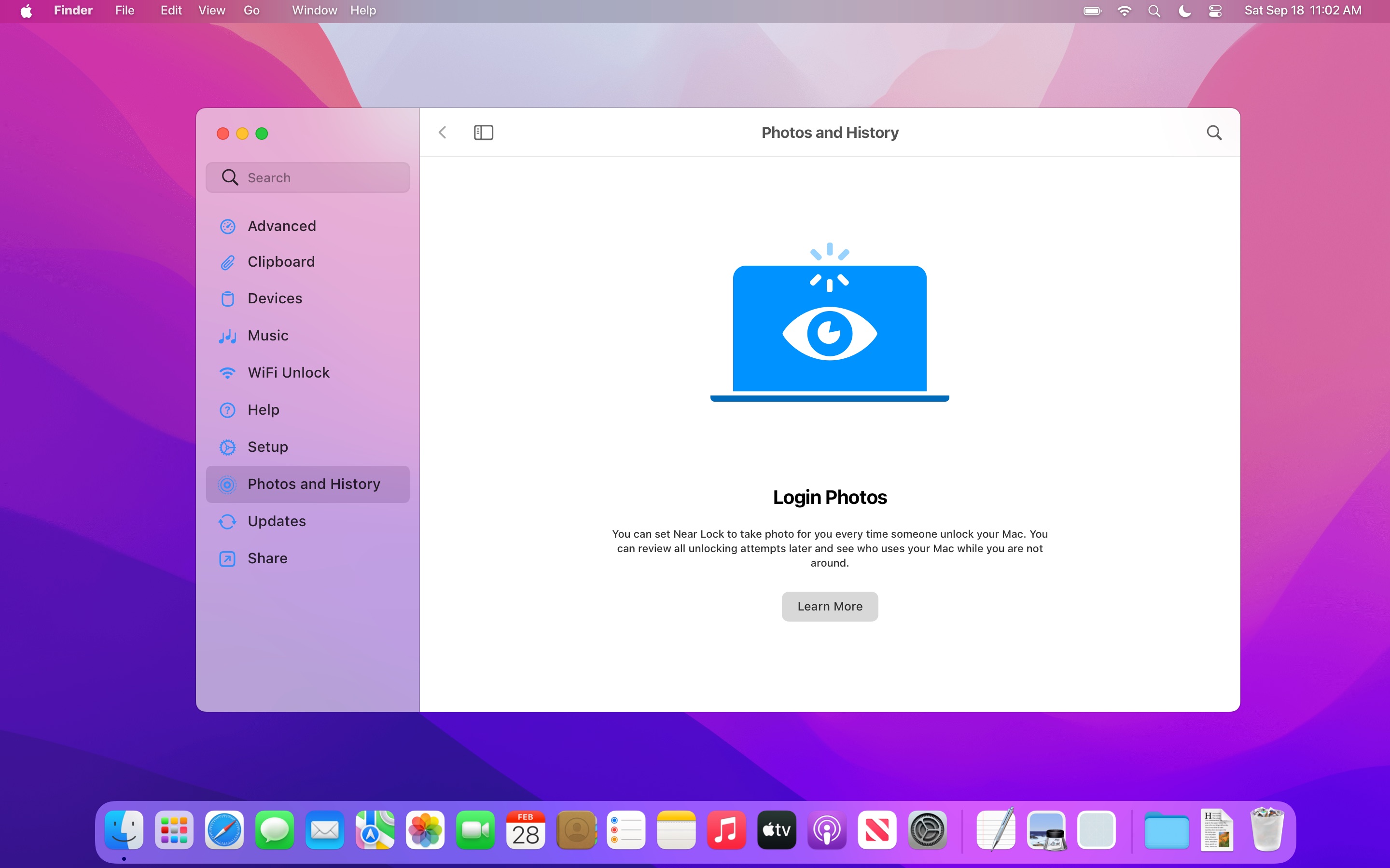
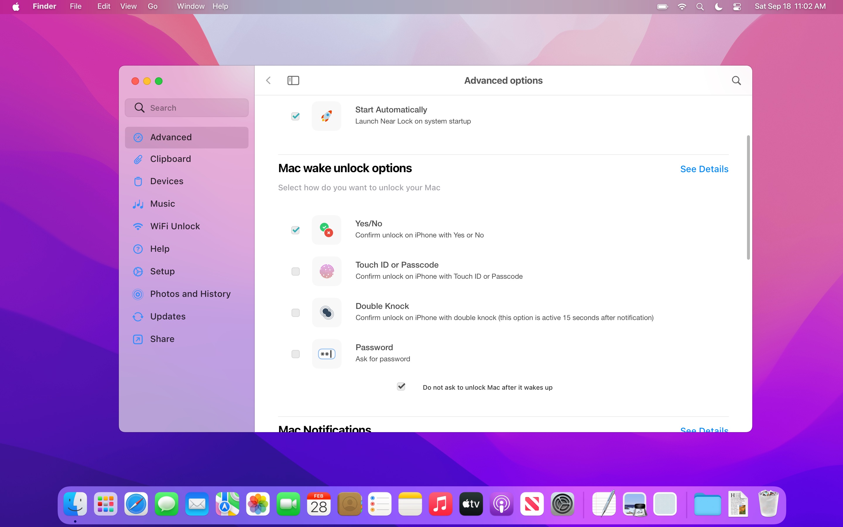
Use your iPhone to lock and unlock your Mac automatically. When you walk away from your Mac, it will be automatically locked. Once you approach your workplace, Near Lock will unlock your Mac. You can easily set the distance on which your Mac should automatically be locked or unlocked. For additional security use Touch ID or Apple Watch to confirm each Mac login.
Design, Branding, UI and UX for iPhone, Mac and Apple Watch was my role, as well as making a landing website for the app, using Photoshop and Sketch for graphics, GIT as version control system, After Effects for Lottie animations and InVision for prototyping.
iPhone
Desktop App
Interactive preview of the Near Lock desktop app
for an interactive preview, please visit desktop version of the website
Calendar App
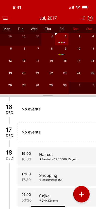
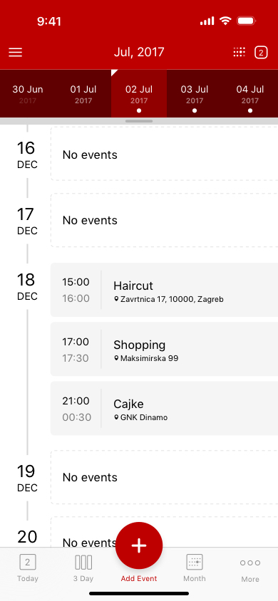
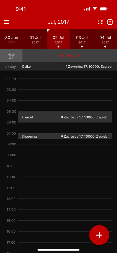
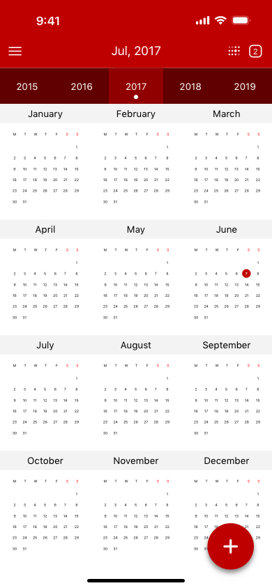
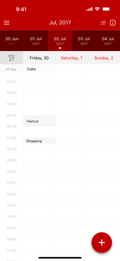
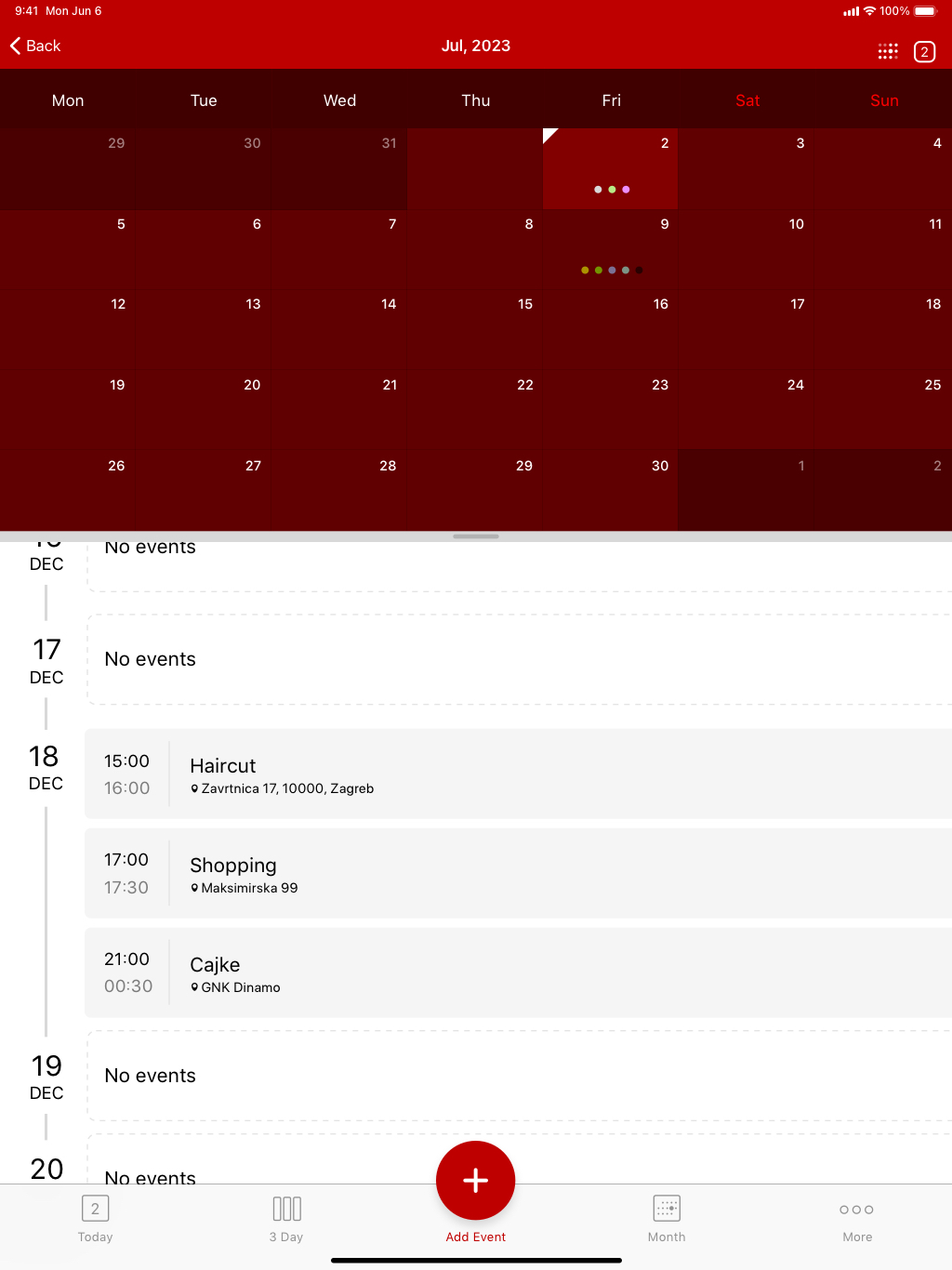
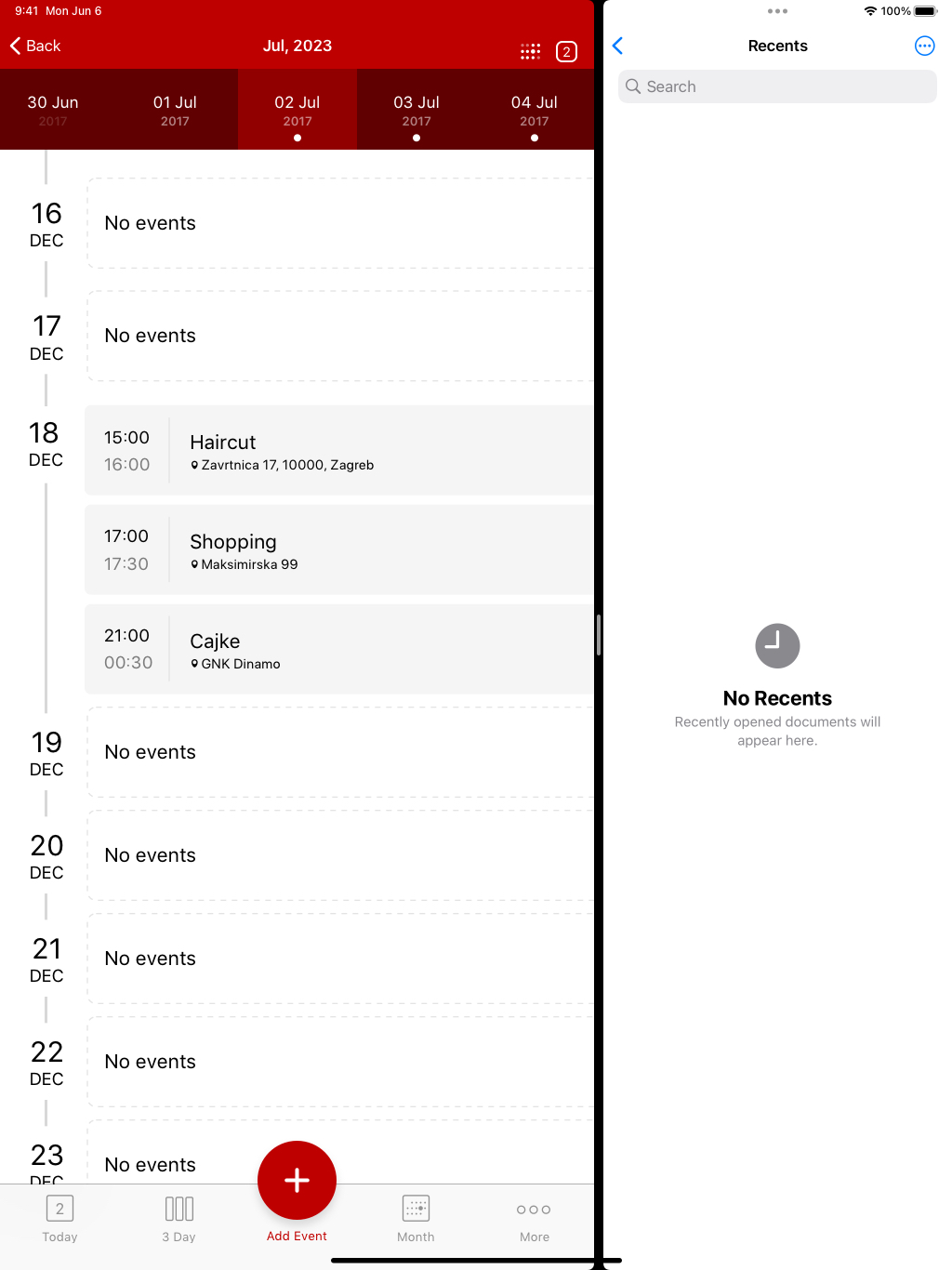
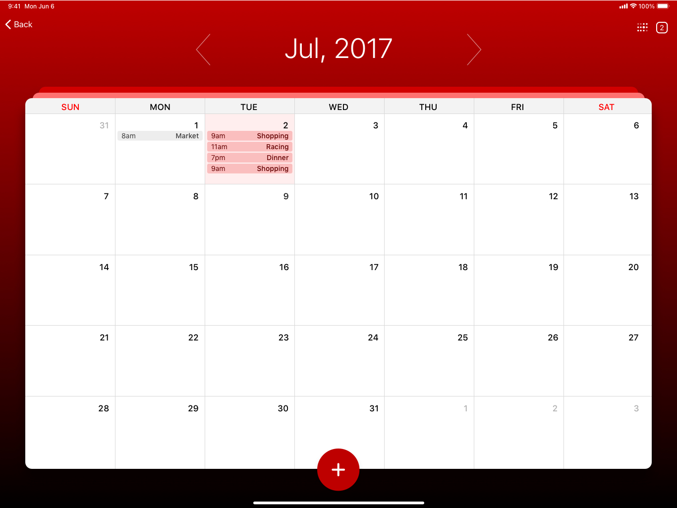
Another Calendar app :) We wanted this to be very customizable, which means you can choose between light and dark theme, colors, and day views. Fast scrollable bar at the top, with current day that is always visible. Floating action button allows new entry from almost every screen. Below you can see iPhone and iPad versions of the App, portrait, landscape and split screen.
iPhone
iPad
iPad Landscape
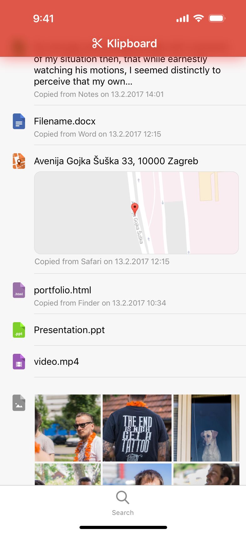
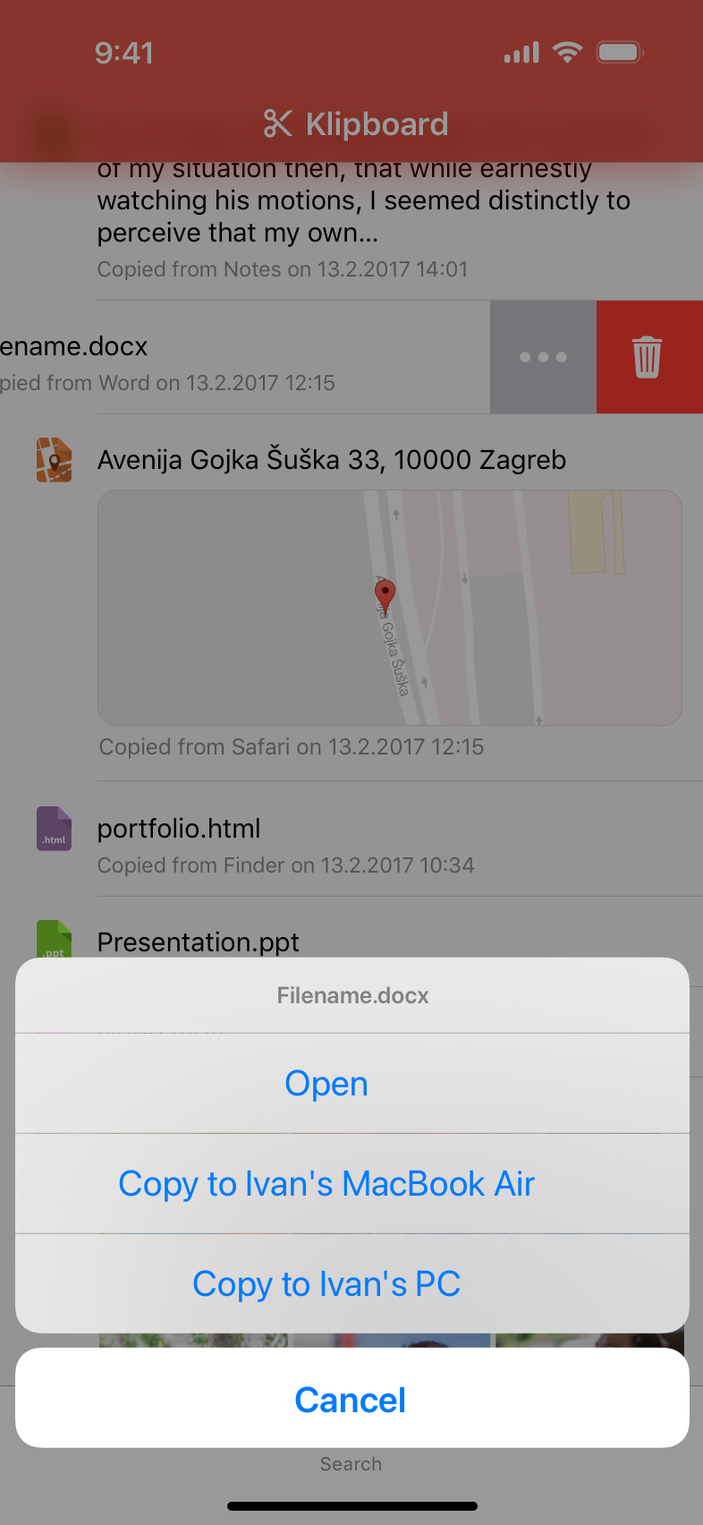
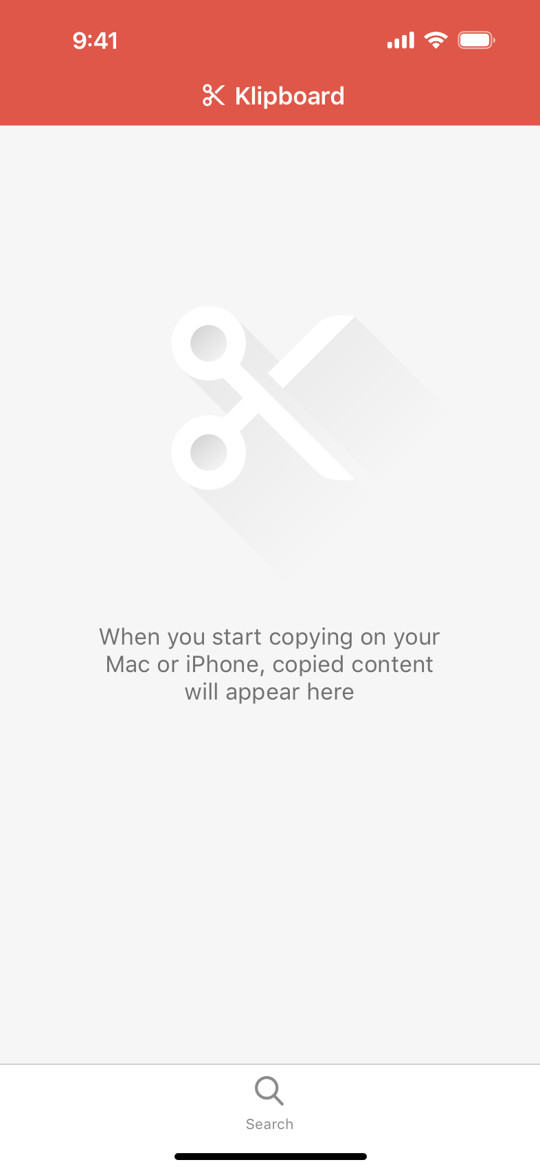
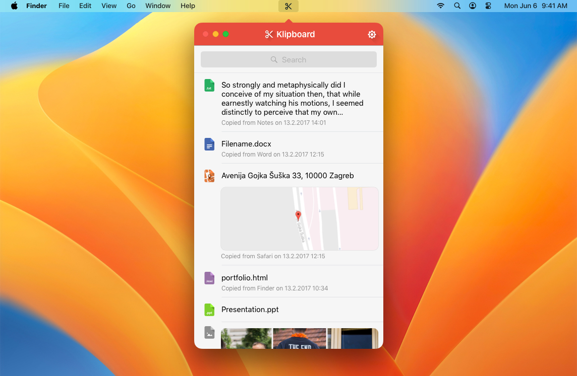
Klipboard App
iPhone
Desktop App
mPBZ App
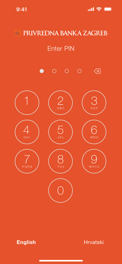
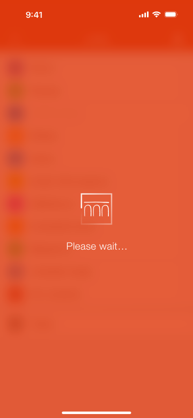
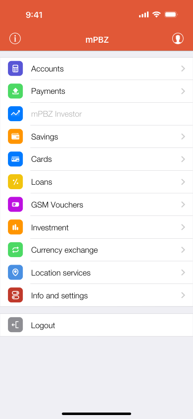
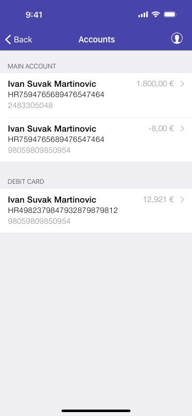
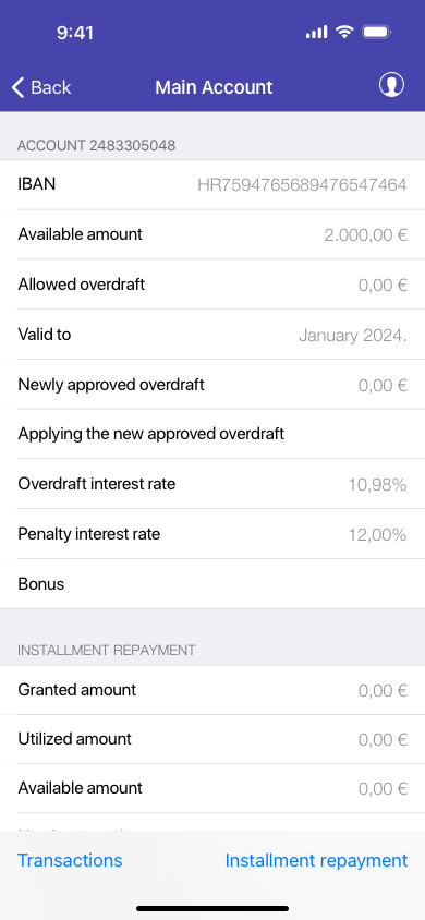
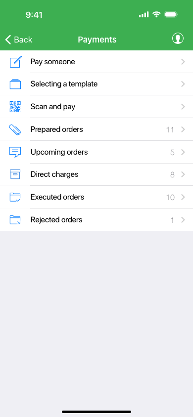
mPBZ app redesign is my way of improving poorly designed iOS banking app that operates in Croatia. Using Touch ID as an authentication for your accounts seems like a reasonable improvement over the PIN entering every time you open the app. Incoporating loader into the logo, gives more power to the branding. Design was influenced mainly by dramatic iOS7’s flat design. Navigation bar color changes according to the icon color from the main screen, for easier recognition and identification of different parts of the app. For example, if you do some activity regularly, like paying your bills every month, if the header color is anything different than green, you will instantly know you are in the wrong menu.
This is just "my take" at the design, it is not official!
iPhone
NOA
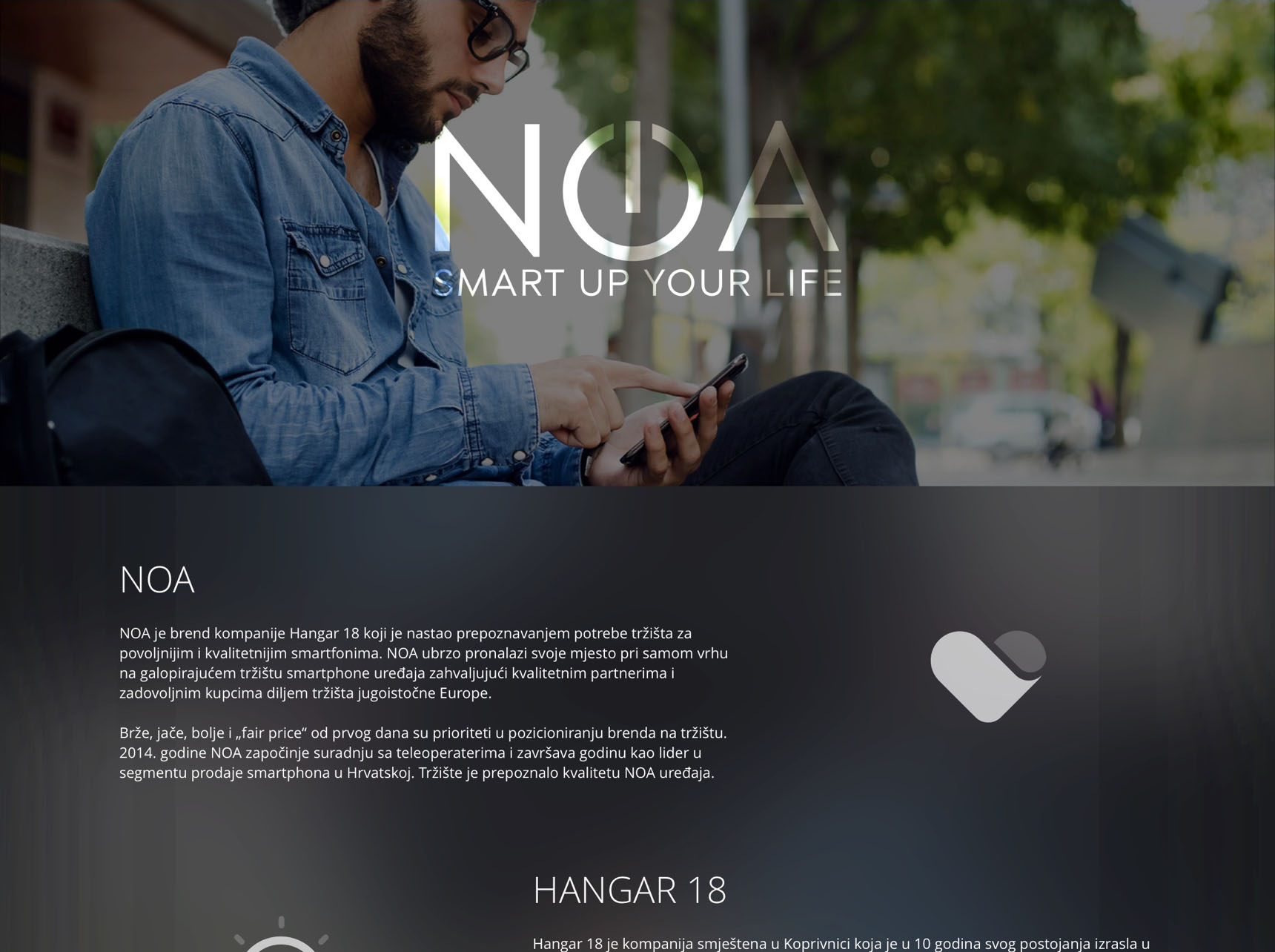
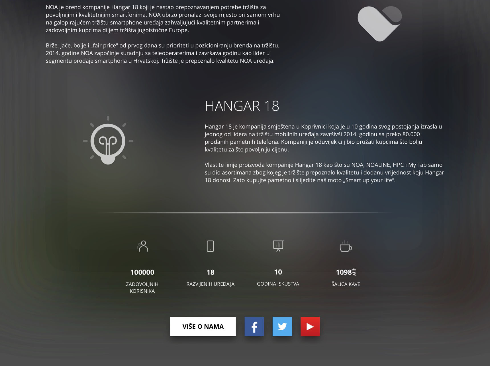
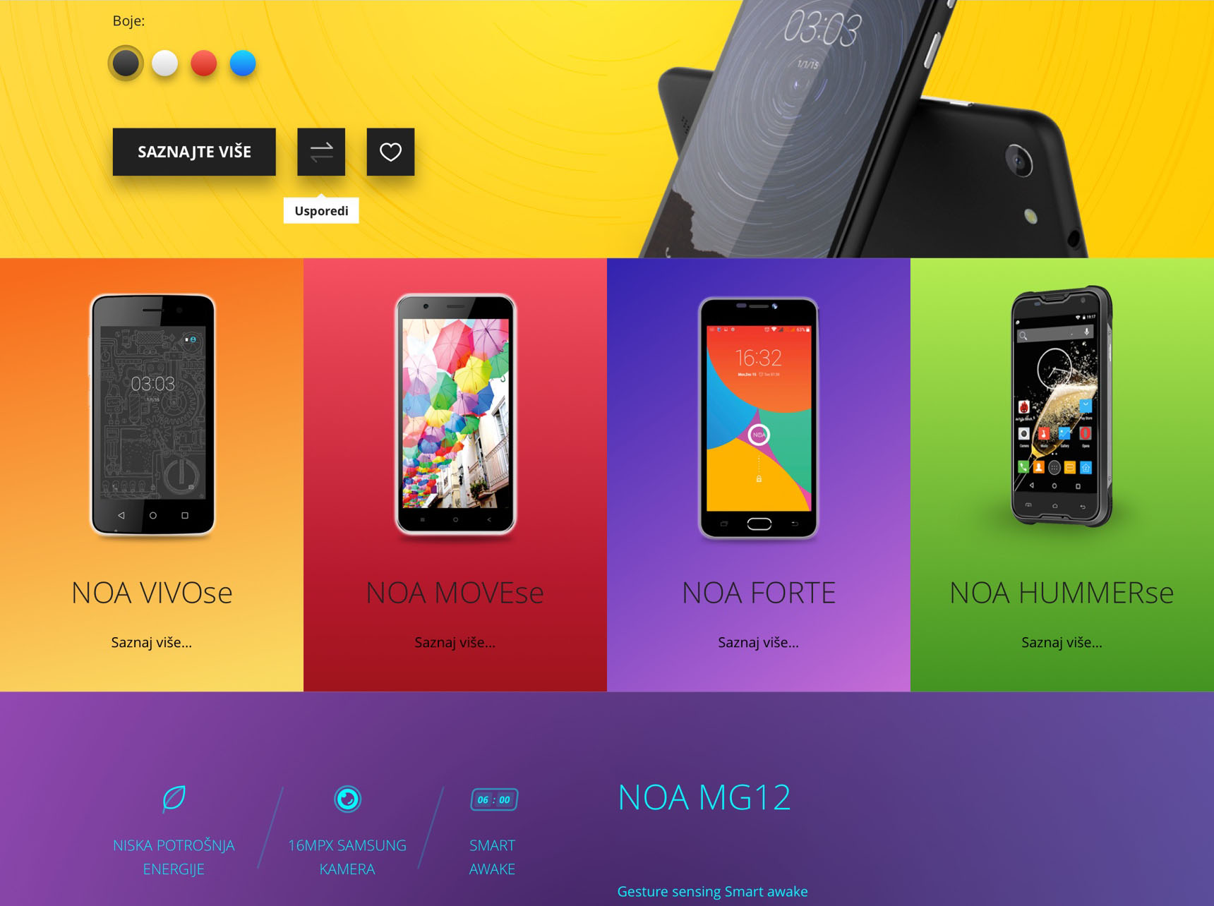
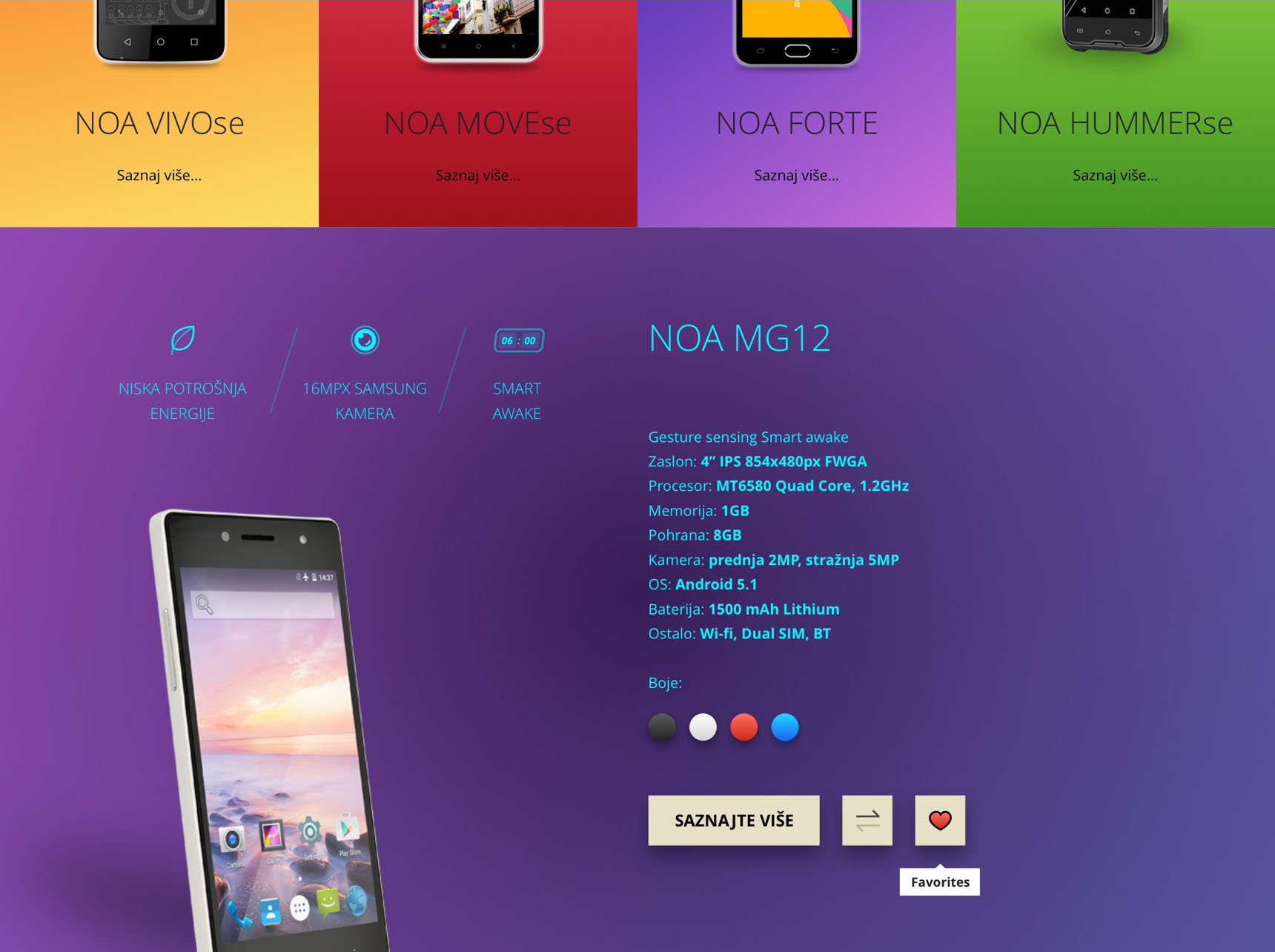
NOA is Hangar 18’s brand used for their mobile phones. They asked me to redesign their old website as a part of my job application.
I thought that the best way to diversify lots of monotonous products would be to associate them with a color, creating visual reminder for a user. Adding options for comparing models and adding to favorites would make users' decision easier while informing them about specifications. I highlighted the three most interesting features above the image of the product. Color picker would change the product case with the selected color.
I think that the design came out really nice, considering very short deadline.
Astronomy Diary App
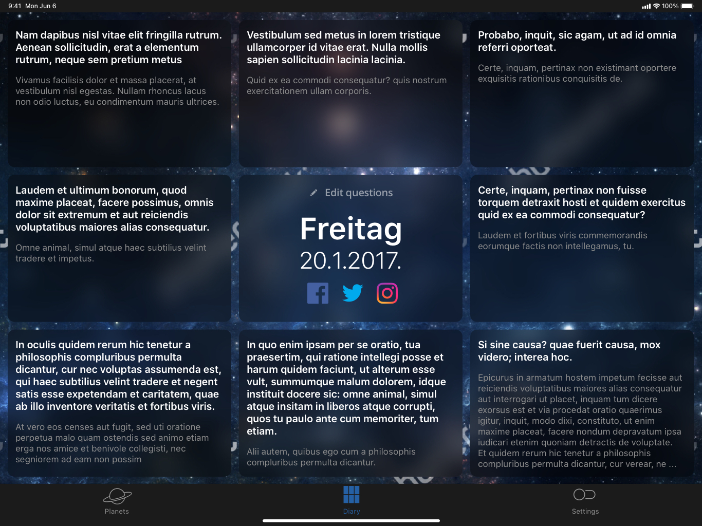
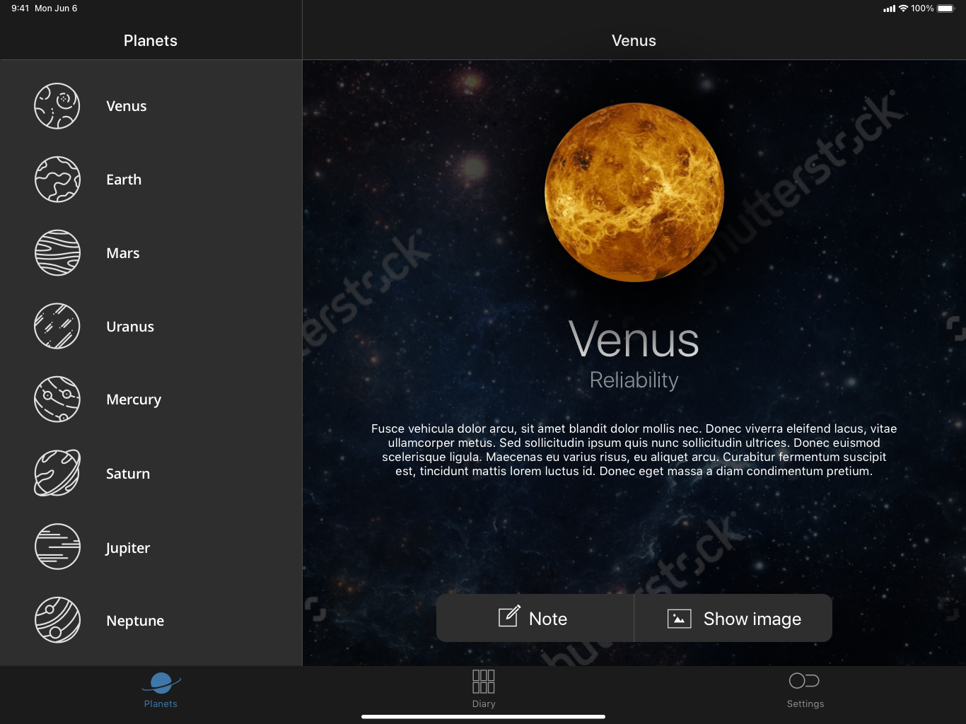
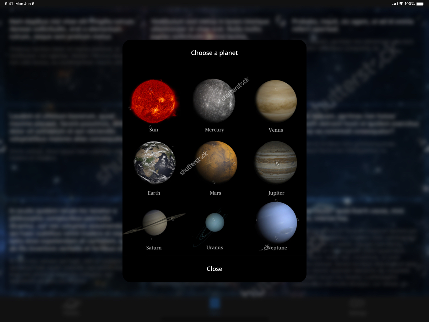
Based on the given flowcharts, I needed to design a simple and clean user interface that includes images of the universe for a daily journal application. After several rounds of mockups, the client chose this design. During the development of this application I also got the opportunity to style the interface using the React Native Framework. This was very intuitive for me as I have a strong background in CSS and HTML. React Native is future!
